Author: rubenavilah

  • HealthFitness app

    HealthFitness app

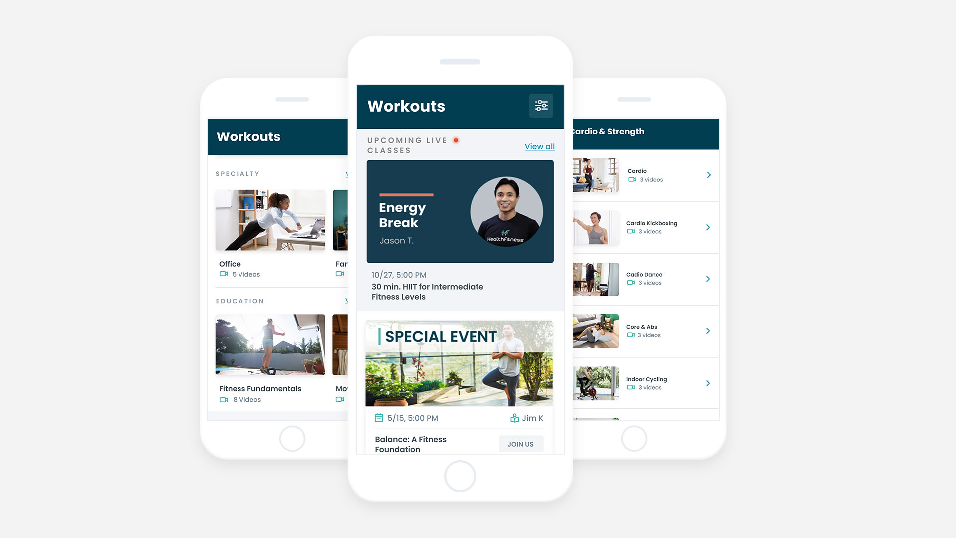
    The health and well-being of working people to get a better life is essential. Through communities and connecting people in a holistic way, we created the HealthFitness app for the Trustmark company. I worked remotely from my home in Bogotá for the Trustmark located in Chicago USA. All this was possible thanks to a great multidisciplinary work team, very focused.

    The challenge

    The HealthFitness team expanded its strategic horizon and positioned itself as a cutting-edge company, which is why they wanted an app. They looked for Globant as a strategic and technological ally and thus be able to develop their business idea in digital.

    We went through several stages to get from the initial ideas to the development of the mobile MVP. We had a discovery stage to understand the business challenges and objectives. Later we focus on designing and developing the MVP ideas with the features chosen for the first release.

    This is the story of the HealthFitness app that went from post-its to launching an iOS and Android app in 9 months.

    The Process

    The work process was quite positive because there was camaraderie between the client and Globant, therefore the relationship was very positive. Discovery’s 4-week process was hard and complex work. However, it turned out very well because it was the strategic tip of the development. During the discovery we carry out these activities

    Stakeholder Map

    During this process we made a clear identification of the participants. With this tool we understood the relationships of all stakeholders and the needs of each one.

    Product Goals and OKRs

    This was one of the most entertaining activities on Discovery. The reason is that there were many general ideas about what should be the most important features of the HealthFitness App. For this reason, we did a divergence exercise to understand the different visions of what the product was and was not.

    User Personas

    Trustmark is an innovative company, since its design team had already identified its user personas. With the user personas we did a recognition and analysis of the pain points. We also discovered that their customers were very different from their users. The user archetypes could be summarized as:

    1. Manufacturing workers: People who worked in industries and factories
    2. Remote white collar: People who work from their homes or places of residence
    3. In-office white collar: People who go to an office every day

    Journey Map

    As a team, we designed the Journey Map of the digital experience and thus we had a clear idea of the stages that a current HealthFitness app user goes through and how we could extrapolate this to the HealthFitness app. With this exercise we obtained valuable information on the steps that would have to be taken in the following exercises.

    Accessibility

    We conducted an analysis of our users and we discovered that many of them had physical and motor disabilities. Our users needed an accessible and adjusted HealthFitness app according to their needs. This is why we used the WCAG 2.1 standard and the mindset was generated among all the accessibility team.

    Brainstorming

    We held a brainstorming session where the team generated new ideas around the HealthFitness app. In this session, very interesting ideas arose that the client hoped to have in the first version of the MVP written in the form of Pain Points and Jobs to be Done.

    Spiders

    With the brainstorm user centric design exercise we had a first approximation of the needs, objectives and tasks of the users. So I decided to create something that I call Spiders. The spiders are to give answers and solutions to the jobs to be done and the pain points with this formula:

    I organized and put the jobs to be done and the pain points in circles of the stages of the Journey Map to generate a spider of solutions to each of the challenges. In this way we generate this graph with all the ideas solved by stage of the Journey.

    Potential List of Features

    Later we had the opportunity to do a Buy a Feature as in Honda Motorcycles, but in digital. This allowed us to prioritize the features that we wanted to make for the HealthFitness app MVP.

    Top Features

    With this prioritization, we once again made a matrix to understand which of these functionalities best met the needs of our users.

    Value complexity Matrix

    With this complexity matrix we prioritize and further refine the tasks to be performed within the HealthFitness app MVP. And this was the initial input to be able to start with the task of Wireframes and Prototyping.

    Wireframes

    It began with the first draft of wireframes of the functionalities that would later pass to the MVP. With these wireframes we had a much clearer vision of what was going to be designed and developed later.

    Value Proposition Canvas

    With all the ideas I made a Value proposition canvas to verify the product Market Fit. This is one of the most interesting exercises as a strategic designer since it allowed me to have a clearer idea of the HealthFitness app. And we generated the product market fit that we were looking for from the beginning. On the one hand the product, the benefits, the features and the experience and on the other the jobs to be done, the pains and goals of our users.

    Mockups

    With all this process, the Mockups of the application were developed, which were in charge of Victoria Quevedo, the VD of the team. She did the screens and flows for each of the features.

    Development and release

    Finally, with all the work done through the SCRUM methodology and with the validations with users, we launched the app to the Apple Store and the Play Store. This was a great event because the whole process was very valuable to me.

    The Results of HealthFitness app

    We discovered, built and launched a health and fitness app for Trustmark users and their HealthFitness App in just 9 months.

    We design and develop the apps for iOS Play Store and Android Play Store of the HealthFitness360.

    In the iOS app Play Store we have 5 star rating by our users.

    What I did in HealthFitness app

    • Design and moderation of Workshops
    • Strategic design to understand the business goals
    • UX persona analysis
    • Accesibility (A11Y) definitions based on the WCAG 2.1 and AA criteria
    • Wireflows and prototype for the Discovery
    • Medium fidelity Wireframes

    What I learned

    1. Focus can beat anything in this kind of developments
    2. Clarity from the start helps things go faster
    3. Whenever there is a good idea, it is better to launch it than to keep it.

    Dates

    October 19, 2023 and July 15, 2024

    Tools that I used

    1. Miro
    2. Mural
    3. Google Slides

    HealthFitness app team

    • Rubén Ávila H – Strategic and UX Designer
    • Victoria Quevedo – Visual Designer
    • Fager Barh – Tech manager
    • Carlos Arteaga – Product manager
    • Evguenia Stepanian – Delivery Manager
    • Oscar Avilan – Back End Architect
    • Fernando Portal – Mobile Architect
    • Jeff Klein – Technical Owner
    • Jennifer Cary – Project Manager
    • Jeff Fitzpatrick – Product Owner
    • Prince Kuman – Solution Architect
    • Michael Sauer – UX and Design Lead
  • Protected: Netflix Experience

    Protected: Netflix Experience

    This content is password-protected. To view it, please enter the password below.

  • adidas app

    adidas app

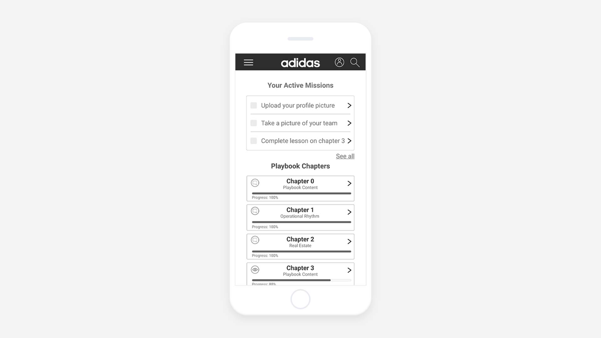
    We simplify and help people to do their work better and faster. The team believe that corporate tools must be entertaining and friendly. We designed an app and the future of the internal processes of adidas app. In just 3 days of a cold September, a team of brave and creative people co-created this adidas app. We turned a meeting room into an adidas store.

    The challenge

    adidas Latam wanted to design and improve the “look and feel” of their brand guide for franchisees throughout Latin America. Analyzing the documents and looking for the best way to present this information we discovered a surprise. In summary more than 10 chapters of content, 300 interactive presentations in PDF format, and 1,500 pages of content. A complex challenge.

    We faced the challenge as a team and began an empathize phase. We interviewed workers from adidas Colombia and adidas stores in Bogota, we visited franchise stores, and attended brand trainings. All of this to understand the business challenges and have an idea of the users of this tool and create around how to solve the challenge.

    macbook with slides of a presentation outside
    Reference image of the Guide PDF

    During the understanding we found that the PDF guide was not a good long-term solution due to the type of users and the amount of content. For this reason we proposed to the client to design one adidas app with:

    1. Accessibility and fully functional without internet
    2. Content easy to learn and put into practice quickly
    3. A functional and friendly navigation

    adidas liked the idea we proposed for the adidas app and asked us about the price of making it. How to estimate the schedule and budget with this rough idea was another question to this process. The adidas app beta need to be availiable in just 3 months. This version will include all the content of the guides in PDF.

    I carefully evaluated the challenge and found that we needed to develop an innovation process within the company and with colleagues who work at adidas.
    So I evaluated the following options:

    Design Thinking Artifacts and Double Diamond (The Ideal)

    ✓ Good option to validate the requirements
    𐄂 More runtime
    𐄂 More human resources

    LEAN UX (The other option)

    ✓ Speed in the evaluation of the idea and prototype
    𐄂 Learning difficulty for the work team and the client
    𐄂 Fair execution time and not so fast to make decisions in a short time

    Design Sprint by Google (The elected)

    ✓ Cost savings for the client
    ✓ A prototype validated with users in just 5 days
    ✓ Follow the methodology and use the artifacts
    ✓ Short time with highly focused execution
    ✓ A clearer idea to estimate schedule and costs

    The Process

    With the Design Sprint proposal, we invited the client to participate in the innovation session and we planned 5 days of intense work from 9 am to 5 pm and the client approved.

    But it wasn’t all happiness, because the client was very happy with our solution to the challenge, but he gave us only 3 days to run the adidas app prototype. At that moment I almost fainted because we were decreasing from 5 to 3 days, the Stakeholder from Brazil who would work with us had other commitments. However the challenge meant that we had to focus on the solution.

    With everything approved, we began the preparations, we sent an mail to all the people of the agency to wear adidas clothes during those 3 days for the special visit and we transform the main room of Wunderman Thompson Colombia as an adidas store.

    meeting room with adidas brand
    Room of the adidas app design sprint
    adidas design sprint 2019 door
    Door of the adidas app design sprint

    Day 1 of adidas app

    The first day was entertaining. In the morning I made a brief presentation so that we all had a very clear idea of what was going to happen during those 3 days and we began to work on the generation of value ideas that answered to the business and design challenges. The first day we executed these artifacts as proposed by the methodology and some extra ones that I considered important:

    Super powers

    Each member of the team introduced themselves and showed their super power for the challenge of the Design Sprint of the adidas app.

    Light talks

    We had 3 presentations (with less than 10 slides) to warm up the ground. First a local inspiration of the Juan Valdez brand and its franchise page. Second, an international example of Mc Donalds with Hamburgers University and its recipe for the perfect hamburger. Finally, a client presentation showing the PDF guide and an executive summary of what he wanted to reach at the end.

    a woman presenting in a room
    Nicole presenting the Hamburguer University case
    People working in a room
    The adidas app team working in their superpowers

    How Might We and Affinity Maps

    We launched general ideas and some specific with the HMW. We think on how to solve this challenge and generate valuable questions for the business and our users. Then we group them into categories by topics, achieving an affinity map and later we vote for ideas to prioritize what we would like to solve in the adidas app.

    Journey Map

    After lunch we generate a Journey Map together, including as much detail as possible with the ideas prioritized in the previous phase. We highlight pain points, pain relievers and everything to generate a good experience for our users in the adidas app.

    People of design sprint looking at the glass with Post-Its
    The adidas app team working in the HMW
    A group of men thinking
    Richie, Lucas and Saul discussing a feature

    Objectives and value metrics

    As we refined the ideas, we designed the objective and the statements of the adidas app. We asked ourselves questions about who our users are, what they need, what was desirable, viable and feasible in the time we had. In addition, we thought about how to measure the success of this product, what tools we would use to measure it, and how we would know if it was a success or a failure.

    Accessibility

    The integration of the Web Content Accessibility Guidelines (WCAG) 2.1 AA into the adidas app for franchises was a crucial step towards ensuring inclusivity and equal access for all users. By implementing these accessibility standards, adidas and the team demonstrated its commitment to providing a seamless and accessible digital experience to individuals with disabilities.

    Worlds of Inspiration

    Ending the day we used this divergence artifact of “world of inspiration” and we worked on generating ideas by “stealing” from other industries that we could apply to the adidas app and solve questions from HMWs.

    People evaluating ideas for the adidas app
    Pau showing us her worlds of inspiration exercise
    A man presenting ideas with his hands
    Lucas presenting ideas related to the experience

    Day 2 of adidas app

    We start the day with a delicious Colombian coffee, our Brazilian client was surprised and delighted to try it. We did one last round of brainstorming and began to converge on the final solution. This day was important because we adjust and discard ideas for the adidas app. This was the work of the adidas app this day:

    Boot Up

    We navigate through the space to converge seeing all the work from the previous day. Each participant read from the walls what they liked and we learned the day before to focus.

    Crazy 8

    We had another divergent space where we drew a considerable amount of ideas to solve, that we couldn’t solve with words the day before. Then new ideas from the adidas app emerged, we voted and selected the most important ones to incorporate into the prototype.

    a man presenting one slide of adidas playbook
    Saul showing to the team some of the goals of the House of Retail
    a guy presenting some ideas
    Exercise of Crazy 8 presentation

    Sketching solution

    With all the information developed, with the clearest ideas and the inspiration sessions, we began to create the adidas app features. The task was to design 5 to 7 screens of how each one imagined the adidas app. We presented the hand sketches as in an art gallery. Took decisions about the prototype and the features we left and removed from the first version of the adidas app. We did a mix and match of the ideas, mixing and generating more powerful solutions. Many ideas were very interesting but we had to focus and converge on the solution.

    Storyboard

    After lunch and with the winning ideas, the client was relevant in the decisions we made. We create the storyboard of the screens and functionalities to incorporate into the adidas app. We created 5 key moments of the digital experience and by hand we refined the hand prototype of the adidas app.

    A woman presenting ideas in a whitewall
    Cami presenting their hand sketching ideas to the team
    designers presenting a journey map and storyboard
    Richie and Lau presenting the final version of the storyboard

    Digital prototype

    At this point and with the central ideas we generate the wireframes and the prototype in Adobe XD to test the app with real users.
    I divided the team in 3 parts because we create the prototype, make an executive summary of the app in a presentation and design the usability tests.

    Day 3 of adidas app

    The last day of the adidas app was dizzying. We continued working with the prototype, conducted usability and concept tests with real users, and shared the results in a presentation that the client needed. This happened on the last day of the adidas app Design Sprint:

    Prototype part II

    We continue with the design of the prototype and discard other features that we could not design due to lack of time.

    Design of usability tests

    The team in charge of the tests worked the 10 tasks to be tested by each of our users. Together with the prototype, the team was adjusting and updating as changes arose in the design of the adidas app.

    Presentation

    The presentation team made an executive report as a brief for the next phase of the process that contained details of the functionalities to be developed, the technical requirements and some features to include in the MVP of the adidas app.

    In the midst of cables, water, coffee, food and stress, it was time to test and validate our hypotheses with real users of the adidas app. There were jitters and joy because the previous days were intense work.

    people working in their computers
    adidas app prototype team
    People thinking in the adidas app
    adidas app usability tasks team
    people working with their comouters
    adidas app executive presentation team

    I conducted 5 remote moderated usability tests with adidas workers from Colombia, Brazil, Ecuador and Argentina. On a whiteboard the team took notes and comments while the users used the prototype. We closed the adidas app design sprint sharing our opinions and details of the experience. We adjusted the executive presentation and everyone was happy, we smiled and hugged.

    The Results of adidas app

    On September 11 at 7:30 p.m. and with the office empty, we finished the Design Sprint and completed the design and validated the MVP prototype of the adidas app ready for UI (User Interface) design.

    In just 3 days, we turned a PDF guide with more than 1,500 pages (that no one was going to read) into a gamified adidas app, with challenges, prizes and learning based on the context of use.

    We had an executive presentation with all the details of the adidas app, so the project management team had a clear idea of how much time and money it would cost to make the first version of the adidas app.

    Our users completed the usability tests with a completion rate of 85% of the tasks presented, which validated many of our ideas and hypotheses.

    The client returned to Brazil with the prototype. He was very happy with the result because we answered his questions with the product prototype. He had never participated in a co-creation process and he even carried out one of the usability tests in Portuguese.

    Update 2020: After this great work in adidas app Design Sprint, the design and development process began with the Agile methodology and the first version of the app for internal distribution was created. The UI was designed with the look and feel of the brand, new needs arose, some ideas from this Design Sprint and new ones.

    adidas app team in the room
    adidas app team 🖤

    What I did?

    • Lead the entire discovery process
    • Design and adjust the methodology proposed in the Design Sprint
    • Lead and guide the Design Sprint of the adidas app
    • Guide the team in taking decisions based on Accesibility (A11Y)
    • Performed usability tests with users

    What I learned

    1. It is possible to create a prototype and validate it in just 3 days
    2. Teamwork and the desire to learn overcome any obstacle
    3. This kind of products needs to be in english from the beginning.
    4. Agility and focused work is very cost-efficient
    5. In the next Design Sprint include at least 1 software developer

    Dates

    September 9 to 11, 2019

    Tools that I used

    • Design Sprint by Google
    • Adobe XD
    • Apple Keynote
    • Post it
    • Sharpies
    • 100 sheets of Paper

    adidas app team

  • Honda Motorcycles

    Honda Motorcycles

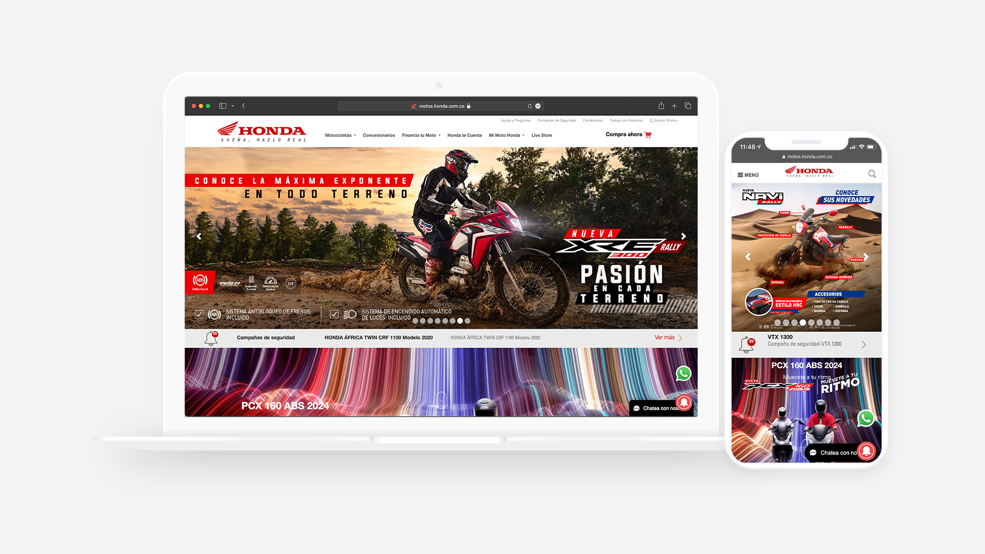
    We ensure that Honda Motorcycles is the engine of Colombian society because we discovered that a motorcycle is more than a vehicle. Honda Motorcycles are dreams that come true. We designed the new Honda Motorcycles website with user centered design between calls, meetings and workshops in Cali and Bogotá, this is the story behind the design and technology team creating high-quality experiences for everyone.

    The challenge

    Despite encountering initial challenges, the marketing team at Honda identified three key goals that guided our approach to redesign the website’s UX and these goals include:

    1. Create and explore new sales with the website
    2. Design a mobile first and modern world class website
    3. Generate valuable metrics based on understanding the digital personas

    Purchase a motorcycle in Colombia have many obstacles and the website also does not help to the users goals. We identify that the photos of the motorcycles were old, the website had only a desktop version, the pricing was not clear, and the look and feel was not aligned with the Honda Motorcycles websites around the world in other words we needed a new website.

    Screencapture of the old Honda Motorcycles website showing the NC 750XD Motorcycle
    Product Page old website
    Screencapture of the old website Honda Motorcycles showing a detail of the motor of a Truck
    Product features the old website

    I started to review all the data and I discover that 80% of our users navigate especially with their mobile phones. Honda needed to integrate a CRM based on inbound marketing to generate leads and of course get data reports to impact the business. So the development team decided for a new technology to support all the features that we started to discover in the process.

    However we had six months for the new Honda Motorcycles UX design and all the coding in the new website. We faced another challenge, the agency and the client had a team unaware of agile methodologies, Scrum, and Design Thinking.

    The Process

    Goals and Benchmarks

    We align and define the KPIs with the client. I explained all the process of the new Honda Motorcycles redesign and at this point we started with the co-creation of the future of the website with User Centric in mind.

    People of Honda Motorcycles placing Post-its in in a cristal wall
    Understanding the Journey Map of the Users

    We created a Benchmark with Honda Motorcycle websites around the world, some competitors in Colombia and brands that inspires us with their digital assets. I performed an Heuristic evaluation to understand the website and some tweaks that we needed to include.

    2 men in a meeting room and a wall of Post-its in the back
    The team reviewing the Benchmark based on features per motorcycle

    User Personas

    We perform at least 10 interviews with stakeholders, salesmen and people who daily serve clients who wants to bought a motorcycle. I visited 3 motorcycle stores, one of them a luxury store because the website needed a division between regular and premium motorcycles. Later we started to create a proto personas based on the empathize phase that we archived. I found 6 personas but we centered the design in just 3:

    1. Los chicaneros and full gas: people with skills, motorcycle experts, and participants of motorcycle communities who roads over the country
    2. Los moto-millennials: young people tired of public transport in large cities who use the motorcycle to get to work or university
    3. The Ants: people were living off their motorcycles, such as messengers, delivery workers, and motorcycle taxi drivers
    Images of Personas UX of Honda Motorcycles Colombia
    Personas UX Honda Motorcycles based on the research

    Workshops

    In the definition we had 4 workshops in Bogotá and Cali, we co-created the vision of the new digital experience for Honda Motorcycles website with the stakeholders. During the workshops, I spoke with experts in logistics, workers of the factory, premium sellers, providers, digital teams and traditional marketing teams.

    Workshop people of Honda Motorcycle Colombia writing in yellow Post-its
    Working on the Value proposition in Cali Workshop

    We worked together with the CRM agency in charge of the inbound marketing and lead generation. I worked with the social media strategists to create a full panorama of the redesign. We even had the opportunity to speak with famous Honda Brand ryders in Colombia, Tatán Mejía and Juan Reyes.

    Information Architecture

    The information architecture was another interesting challenge because the SEO and SEM strategy requires validation of different areas involved in the creation. The marketing team understand the differences between the navigation in the website for the users and the motorcycle client product in references. We had 6 different iterations keeping in mind our user needs and business legal requirements.

    Paper Wireframes

    In each workshop, we recorded the ideas in paper “wireframes”, having a puzzle of the Honda motorcycles. Then we unite with the team all the pieces to have a first draft of the website with the proto personas, the initial understanding of our users goals, needs, characteristics, frustrations, and personalities.

    With this validation, the proto personas and other interviews, we understand the needs of our users, the use of the web, the context in which they would use, and the different categories of motorcycles that the brand offers.

    Wireframes in paper placed in a cristal wall
    Wireframes and sketch ideations based on the ideas of features

    Accesibility (A11Y)

    In addition to improving user experience, integrating WCAG 2.1 A into the Honda Motorcycles Colombia website ensures compliance with legal requirements. Many countries, including Colombia, have laws and regulations that mandate equal access to digital platforms and services for individuals with disabilities. By aligning with these accessibility standards, Honda Motorcycles 🇨🇴 demonstrates its commitment to inclusivity and accessibility, reinforcing its reputation as a socially responsible brand.

    Prototype

    I designed the entire user flow in medium fidelity wireframes with Sketch, then I assembled the prototype in Marvel App to test, based on the information architecture, proto personas and wireframes that I already have.

    The new Honda motorcycles website was too diferent from the previous, so I tested it with real users; the new information architecture, the new features, the new categories, and the new services.

    Animated image of the prototype of Honda Motorcycle

    User Research Test

    My main goal was to create a usability tests with 12 people distributed in 4 of each segment. It was a complex job to set up the tests because I adapted a meeting room as a research laboratory; I covered all the windows, connected an external TV with sound where the client would be watching the process in real time, and prepared the testing software. For the user research I use this tools of Design Thinking and we run the tests with:

    1. A semi-structured interview to validate the UX persona – 10 min.
    2. A usability test using the mobile prototype – 10 Tasks ~ 30 min.
    3. A card sorting to validate the information Architecture and users’ mental model ~ 20 min.

    Visual design

    I created 3 Style Tyles with the help of art directors of the Honda Motorcycle, and together we define the new site’s look and feel. And I think, uhmm we are near to the end…

    I created the visual language, the visual schemes, the layout and the interface design with a UI kit to extend all the possibilities to creative team, that supports Honda Motorcycle client.

    Content design

    We validate the content to the website; the client told us that many of the bikes had changed, the product team added new editions of motorcycles and eliminated others.

    At this point the creative team took new pictures, created a 3D photos for the website and designed the headers for ~70 motorcycles. The client wants a personalized image based on the main characteristics of the Motorcycle.

    With the help of Dani (account executive) in a midnight hackathon we get all the specifications for the motorcycles, adjust the content and create a new ones.

    And finally we delivered the main mockups in Mobile and Desktop to the front-end and back-end developers who used Angular JS and Laravel for the Honda motorcycles UX website.

    The Results of Honda motorcycles

    On February 5, 2019, we launched the first version of the Honda motorcycles website with a huge impact in their digital sales. The digital marketing team sell more motorcycles than 5 physical stores of Honda Motorcycles.

    We increased site visits by 250% in Mobile with a fully responsive website and reduced the bounce rate by 25% with a modern technology and with the standards of the international brand of Honda Motorcycles UX.

    We connected the entire inbound marketing strategy with CRM agencies, lead generation, analytics, data generation, and social media networks. This process helps us to understand the end-to-end digital journey of our users.

    Update 2023: The original idea of the site that I created remains however I am no longer working with this client and the current site does not reflect my thinking and work on how to scale this design.

    What I did Honda Motorcycles?

    • Design and moderation of Workshops
    • UX persona and features prioritized based on the empathy map
    • User research moderated with motorcycle users of the brand
    • Wireflows, prototype and low medium and high fidelity Wireframes
    • UI Kit, mockups for mobile and desktop versions, including 25 templates and guidelines on how to scale the design
    • Accesibility (A11Y) guidelines following the WCAG 2.1 and A criteria
    • Create ordering the design and development product backlog

    What I learned?

    1. Many stakeholders in the project will be more diverse, but the team can lose focus
    2. Changes in the marketing team and content always affect the UX of the website, I learned how to handle this
    3. Creation and content design always takes time, especially in companies with too many products and photographs
    4. Motorcycles move the economy of the most humble people, especially in countries like Colombia
    5. The Scrum methodology is a good idea if you have resources and people dedicated to the project

    Dates

    April 2018 – January 2019

    Tools that I used

    1. Post-it
    2. Sharpies
    3. ~ 500 sheets of Paper
    4. Sketch
    5. Zeplin
    6. Marvel

    Honda Motorcycles Team

    • Rubén Ávila H – Product Lead Designer
    • Santiago Robledo – Account Director
    • Luz Angela Palomino – Honda Lead Project
    • Gabriela Rey – UX Designer
    • Cristian Paez – PHP Backend Developer
    • Steven Piñeros – Front End Developer
    • Diego Rodriguez – Art Brand Director
    • Wunderman Thompson – Creative Designers
    • Honda Digital Team